Design
The design settings allow you to customize the appearance of your store, including colors, fonts, backgrounds, and dark mode options.
Settings
Cart Icon and Add to Cart Button
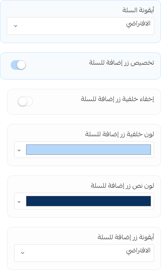
- Cart Icon: Choose the style for the cart icon.
- Customize Add to Cart Button: Enable or disable custom styles for the add to cart button.
- Hide Background: Toggle the visibility of the background for the add to cart button.
- Background Color: Set the background color for the add to cart button.
- Text Color: Set the text color for the add to cart button.
- Icon: Set the icon for the add to cart button.
Store Background
Image
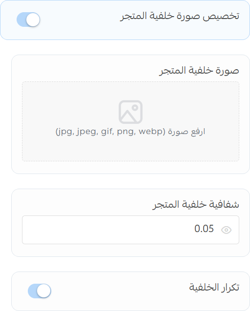
- Enable Store Background Image: Toggle the visibility of the store background image.
- Image: Upload an image to be used as the store background.
- Background Opacity: Set the opacity of the background image.
- Repeat Background: Choose whether the background image should repeat.
Pattern
-
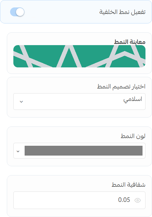
Enable Store Background Pattern: Toggle the visibility of the store background pattern.
- Pattern Preview: Preview the selected pattern.
- Pattern: Select a pattern to be used as the store background.
- Pattern Color: Choose a color for the background pattern.
- Background Opacity: Set the opacity of the background pattern.
Store Colors
-
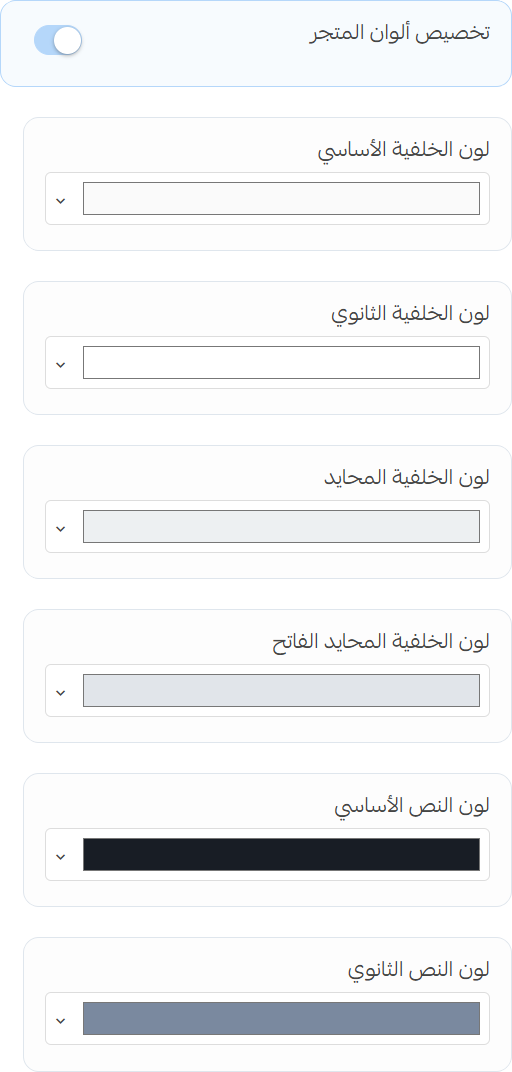
Custom Store Colors: Enable or disable custom colors.
- Background Color: Set the main background color.
- Background Secondary Color: Set the secondary background color.
- Neutral Color: Set the neutral color.
- Light Neutral Color: Set the light neutral color.
- Text Color: Set the text color.
- Text Secondary Color: Set the secondary text color.
Dark Mode
-
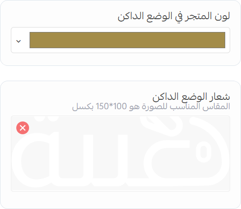
Enable Dark Mode: Toggle the visibility of dark mode for the store.
- Store Accent Color: Set the accent color for dark mode.
- Logo: Upload a logo to be used in dark mode.
Dark Mode Toggle
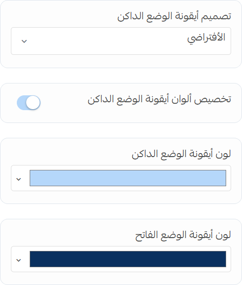
- Toggle Icon Style: Choose the style for the dark mode toggle icon.
- Custom Toggle Colors: Enable or disable custom colors for the dark mode toggle.
- Dark Mode Color: Set the color of the toggle icon in dark mode.
- Light Mode Color: Set the color of the toggle icon in light mode.
Dark Mode Colors
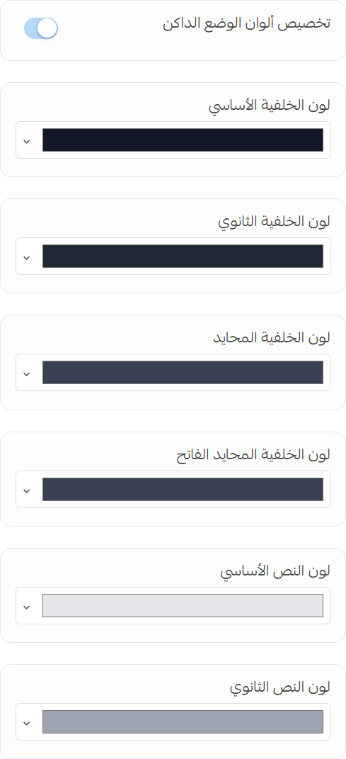
- Custom Dark Mode Colors: Enable or disable custom colors for dark mode.
- Background Color: Set the main background color for dark mode.
- Background Secondary Color: Set the secondary background color for dark mode.
- Neutral Color: Set the neutral color for dark mode.
- Light Neutral Color: Set the light neutral color for dark mode.
- Text Color: Set the text color for dark mode.
- Text Secondary Color: Set the secondary text color for dark mode.